Most of us aren’t interior designers by profession and don’t know much about it. Well, that’s okay! Whether you consider interior decoration as a fun filled hobby or a necessary demon that make your home look updated and presentable, sometimes it can be tough to understand the lingo’s. After all, we hear a lot about Tertiary Colors, primary colors, etc? In this blog, we will provide you detailed information about the color therapy and how it is important for the home. So, today in this post we are going back to the basics. Gear up for interior decoration design. In this post, we will tackle color theory basics that every interior designer should know. After you have read this post, make sure to bookmark this link and make it easily accessible. It will come in handy next time when you wish to add paint to the home, but you aren’t sure whether you have selected right paint color or not.
How to make use of the color wheel?
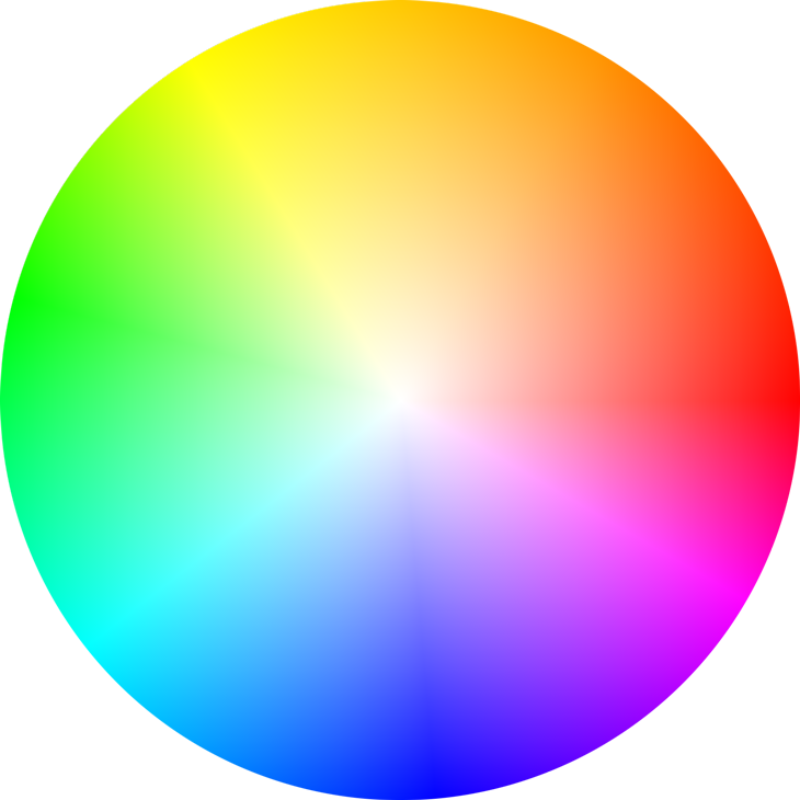
Like trigonometry or other basics, the color wheel is probably one among those things that you need to learn as a young child, if you still not thought about the same. However, to really understand the color wheel, you may have to dust off that age old traditional knowledge. To put it simply, the color wheel provides a visual representation of which colors blend together. It removes all kinds of guess work. However, in theory color wheel can be explained as an infinite number of shades in a wheel. Don’t fret, if you haven’t memorized the color wheel yet. There are tons of colors that can be accessed digitally. There are several websites like Paletton that helps you to create your own color scheme from the comfort of your computer screen and there are several apps available on smartphone that helps you do that. The colour wheel is important to understand when understanding what color theory is all about. This image will describe colour wheel in a better way.
Basic colours that you need to learn about

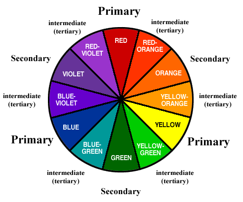
Colour wheel doesn’t constitute 12 colours. However there are 12 colours in the colour wheel. Thinking of how it is possible? Well, there are only 7 shades in a rainbow.” True, but trust us in fact there are at least 12 shades in the colour wheel. Confused, where this discussion is leading to? Well, let’s clear off the air:
Primary Colours– Primary Colours are the basic colour that colour wheel is made up from. It consists of red, yellow, and blue. These colours cannot be made by mixing other shades.
Secondary colours– Secondary colours include orange, purple and green. It can be made by mixing primary shades together.
Tertiary Colours– These six shades can be made by mixing both primary and secondary colours, isn’t interesting?
If you are unsure about where to begin with when it comes to colourful interior decoration, one of these 12 shades is often a good starting off point. Pick one among them and it will help to narrow down your choices until you select the shade that you love. Primary and secondary colours can instantly brighten up the space. The image describes it the best.
Change the colour with neutrals as backdrop– Once you have selected a basic colour scheme, you can create different versions of it within the same family. All you need to do is to add neutral shades to it. When neutral shade is combined with the primary or secondary colour it will make the room look beautiful and best. In interior design parlance, it is called as a tint, shade or a tone.
Let’s jumpstart with what is tint, shade and tone and how it can make the home look beautiful.
Tint- It is an act of lightning a colour by adding neutral white to it
Shade– It is an act of darkening the shade by adding black to it
Tone– It is an act of slightly darkening the colour by adding gray to it
Many artists recommend experimenting with different colour scheme by mixing paints until you have a feel how drastically neutral shades will affect a colour. However, if you don’t have access to the supplies, you can see an example of tinting and shading by going to home improvement store and picking up few from those colour palettes. Creating tints and shades by adding neutral shade to base colour is the best. The image speaks a lot about this.
4. Understanding Color Temperature
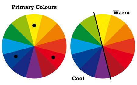
It is important to understand the colour temperature. Confused? How colour can have temperature? Well you have read many times in this blog how to warm up your dining room or how to add cool touch to the bedroom. Well, these temperature describe where the colour lies. Red, orange and yellow are described as warm colours. They are typically more lively and seem to bring vivacity and intimacy to the space. In contrast, blue and purples and green are considered as the cool colours. It adds relaxed and cool feel to the room. W hen selecting colour temperature for a space you should consider the size of the room. Using warm colour in a tight room could make it feel like overwhelming. However, cool colour in a spacious could leave things feeling stark.
5 Complimentary colour scheme
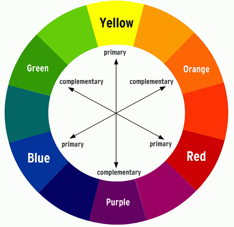
When it comes to colour schemes, complimentary is the best. It uses two shades that sit opposite on the colour wheel.
How can one achieve this colour scheme?
Typically, one colour act as a dominant shade and other colour act as an accent. It means the combination like red and green, blue and orange or yellow and purple. This colour combination is extremely score well in terms of contrast, which means that it works best when used in small doses and when you wish to draw attention to a particular design element. You could use it to make your bathroom spruce up or to bring vibrancy to the home office. If you select a particular compliumentary colour scheme, you need to embrace neutral shade. They will provide calming effect to eyes and keep you from being too overwhelmed in a room. Use neutral colour scheme to balance out the design.
Split Complimentary Colour Scheme

If you like the idea of complimentary scheme, but are afraid to experiment or you think that is too bold for your tastes, split complimentary colour is the best option.
How can one achieve this colour scheme?
To make this colour scheme work, you need a base shade. Then instead of selecting the colour directly opposite to the base, select two shades on either side of opposite colour. These two shades will provide visual appeal and balance to the room. You can still get the visual impact of the bold shade, but you’ll be able incorporate more of it instead of relying on neutrals to calm the space interior. Split colour works the best when you use base colour as a dominant colour. However, instead of selecting saturated shade, try to focus on a colour that is muted. Then go bold with other two shades in the room. Split complimentary colour scheme often pacifies the complimentary counterparts.
Analogous Colour Scheme
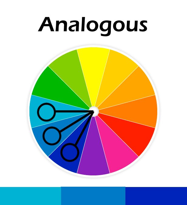
The analogous colour scheme refers to using three colours at one time on the colour wheel. Typically, two colours can be either primary shades with the third being a mix of two and secondary shade. For instance, you can select red, orange, yellow or red, purple or blue. The key to using this colour scheme is to use it in right proportion. Again, 60-30-10 rule comes into picture.
How can one achieve this colour scheme?
You need to select one colour scheme that will play the dominant role one support element and third the most vibrant colour as an accent. Interesting, you can use this colour scheme by using neutral shades. It is typically known as monochromatic colour scheme. The colour combination that works is black, white and gray instead of bright shade. Stay in one section of the colour wheel to create a relaxing look.
Triadic Colour Scheme

As the name states, triadic colour schemes means adding three colours to the bedroom, living room or guest room. This colour scheme is also referred as triad, which means using three colours as a combination with equal space to maintain a balance between the colour wheel.
How can one achieve this colour scheme?
This type of colour combination is too bold. Since the colours are in high contrast and pure shades are generally used, hence this kind of colour scheme is generally fond in children’s bathroom or playroom areas. When using these colours keep in mind they are bold and lively colours, hence it is important to consider the spaces that are nearby. You don’t need to put different kind of triadic colour schemes next to each other, as it will create an overwhelming effect in the room. Instead, make sure that the rooms next to triadic space are neutral and calm. The boldness of triadic colour scheme makes it an apt choice for the kid’s room.
Tetradic Colour scheme

After considering triadic colour scheme, the colour scheme that is raging in the present times is tetradic colour scheme. It makes the thing little more complicated. Here we are moving on four colours in the space. This scheme is also reffered to as rectangular colour scheme because it makes this shape on the colour wheel, focusing on using distinct pairs of complimentary colour scheme.
How can one achieve this colour scheme?
In this colour scheme, temperature plays an important role. Ensure that you use two warm or two cool colours to fill up the space rather than using an odd number. Using an even amount will help to balance the look. It is also important to view the colours as a unified colour scheme and don’t hesitate to mix with bold pieces. If you use all solid pieces in the room it will make the room look too busy and too many patterns are sure to clash, so focus on selecting one or two patterns that will help to make the space.
Square Colour Scheme
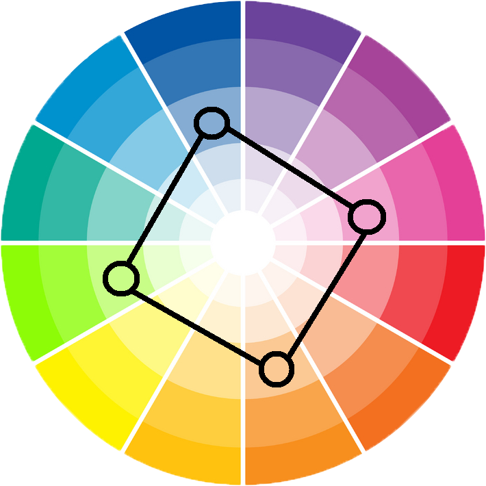
Another colour scheme that is gaining huge momentum in the present times is the square colour scheme. This scheme is very similar to rectangular colour scheme in terms of number and name, with the only difference that instead of focusing on the opposite pairs, the colors are evenly spaced throughout the colour wheel.
How can one achieve this color scheme?
No matter which colour wheel you select, this scheme will be comprised of primary colour combination and one secondary and third tertiary color scheme. Depending upon four colour scheme it is important to vary the intensity of color scheme by making two shades neutral and two a bit bolder in comparison to other two. Again, similar to tetradic colour scheme, you need to pay attention to both warm and cool colours. But rather than paying equal attention to both the color scheme, you select one shade that dominates the space and other three as accents.
To sum up there are various colour schemes that you can add to your home, only you need to know how to add it. Want to add something to this story, please add in the comment section given below.

